10 years ago today, Charlie Sells & Chris Page launched a pioneering & unique production agency representing a collection of the world’s finest creators. Their vision was to create an umbrella of renowned talent to form a dynamite creative production house that would deliver high-end content across all media platforms.
With the idea that the company could evolve, adapt & mould to almost any brief, Jelly London was born.
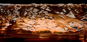
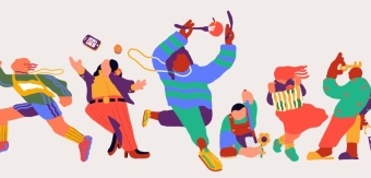
Since 2006, Jelly has created outstanding creative content for some of the best clients & brands in the world, including Cadbury, Nike, French Connection, BBH, M&CSaatchi & adam&eveDDB. The Jelly team are always on the lookout for new & interesting talent, and constantly adapt to find the best ways to work with new & existing clients.
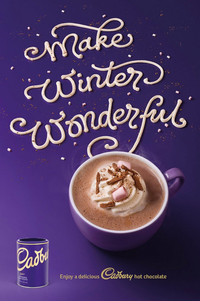
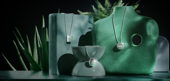
Alison Carmichael for Cadbury
Celebrating 10 years of soaring success, Jelly decided to rebrand & refresh their website to re-establish the brand’s identity as a progressive & innovative agency, who have matured & grown into a category of their very own.
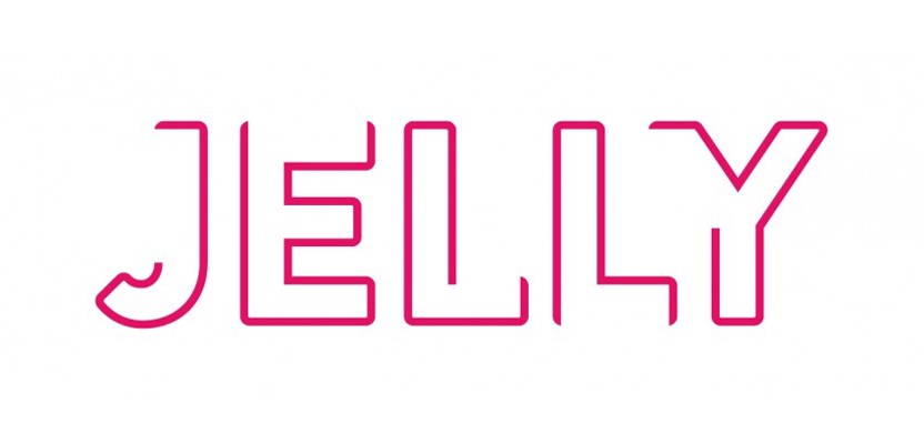
Working with designer Tom Hardy of Manifesto Studios, Jelly’s new rebrand aims to encompass everything that Jelly is, and all that Jelly can be. Whilst sticking to the former colour scheme of pink, white & black, Jelly’s new logo uses fluctuating lines & comes in a variety of different versions to visually represent how Jelly is unrestricted & always evolving. Other elements of Jelly’s brand toolkit build on this idea to show movement and energy throughout the brand.
Jelly’s rejuvenated website aims to showcase the importance of the brand, but with a simple approach, to allow their creator’s work to resonate & images to be hero.
Tom Hardy on working with Jelly
“One of the founding principles of Manifesto Studios is to only work with people who are as passionate as we are about their day job, and this was definitely the case with Jelly. A great collaborative process to better represent who Jelly are as a company and their business vision for the future.
We learnt the main point of difference was a continuous interest in looking out for new talent paired with an ability to adapt to find creative ways to partner with clients. This led to the brand idea we developed based on ‘constantly evolving', which built on the idea behind Jelly’s name. We created a new logo which animates and has multiple static versions of it frozen in time. We used the Brandon typeface family to add more personality and created an initial cap headline treatment which picks up on the visual approach used in the logo. Jelly were known for their pink so we kept it but made it a richer hue so its easier to use with white copy onto. We also added a midnight blue to complement the pink and make it feel more professional.

With the brand identity tidied up we worked with the team to make their whole marketing suite more contemporary, with more white space and a clearer information hierarchy to better showcase the artists they represent. We followed this principle through with the website, working with NeverBland to bring it to life. We redesigned the site, added functionality to represent the brand idea and improved the overall user experience.
The end result was a labour of love and a brand which is much more evocative of who Jelly are and the creative talent they represent.” – Tom Hardy, Manifesto Studios
See Jelly London's new website: www.jellylondon.com